
IWCA is stronger because you are. A new look for what we've built together.
For twenty-three years, this logo has represented IWCA.
This logo has traveled to origin, into boardrooms, onto banners at conventions across the world. This logo has meant something because of the work chapters have done alongside it.
In 2003, six women believed something simple: that women in coffee are stronger connected than alone. That belief became IWCA. That belief hasn't changed since. What has changed is the scale IWCA now holds, more than 40 chapters creating a network built by people the founders could never have met individually, doing work they could never have planned from a single office.
Today, we're introducing a new look for IWCA.
This new look honors the original design. Same name. Same mission. More room to grow.
Why now
Every chapter builds differently. A chapter in one region strengthens local partnerships. A chapter in another expands training access. A chapter somewhere else builds market connections no single office could have designed from the top down. None of that work looks the same from region to region, and none of that work was ever supposed to.
This logo update is part of a five-year strategic plan set in 2023 by IWCA's Board and Executive Director, a plan built to strengthen the systems connecting this network as it grows. A shared visual identity makes the connection between chapters visible, to each other and to the world.
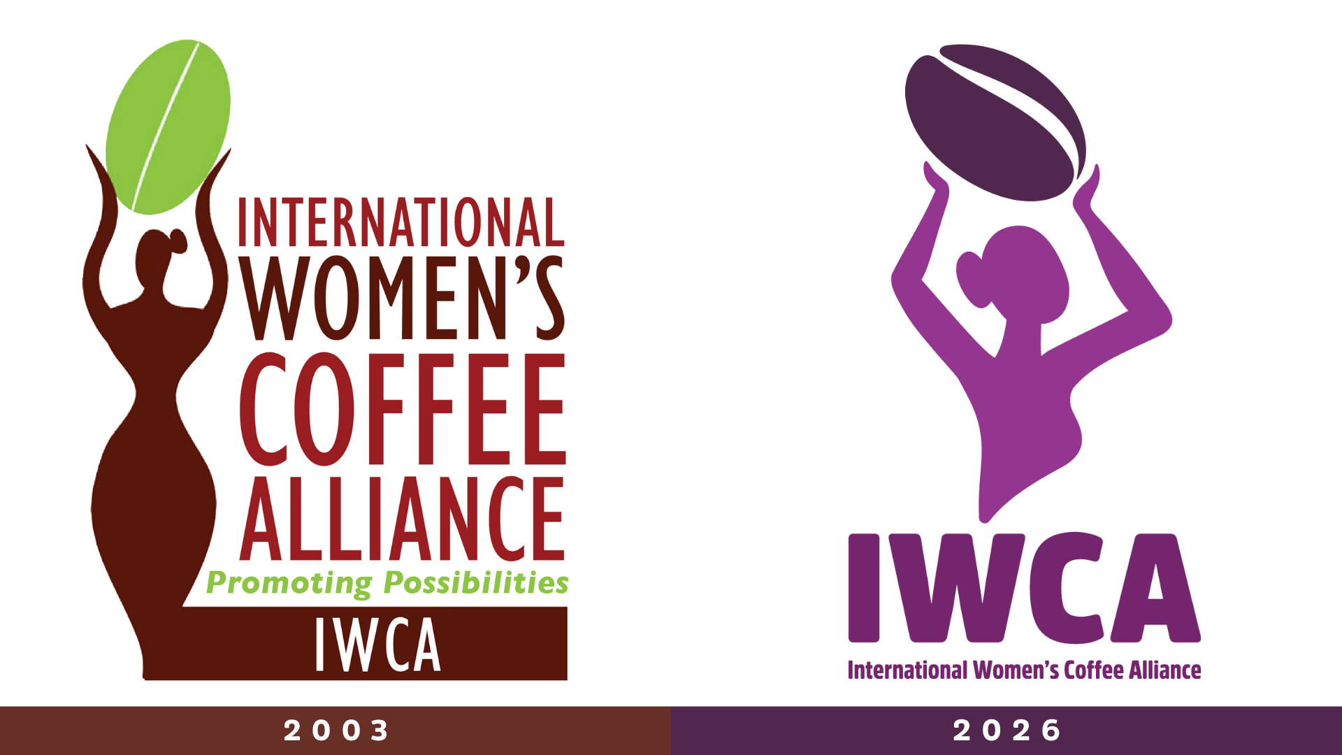
What's changing, and what isn't
The name stays. The mission stays. The work chapters are already doing stays exactly what it is.
What's new is a visual identity built for the network IWCA has actually become.
Alongside this new look, we're opening new ways to work with IWCA. Organizations across the coffee industry who want to support this network, its chapters, and the women driving it forward are invited to reach out. Because when women are empowered, communities thrive.
A network that keeps building
Every chapter that's ever used this logo, at a training, on a banner, in a partnership meeting, added something to what this logo means. A shared identity gets built together, chapter by chapter, region by region, for over two decades.
This new look moves that legacy forward. This new look is a symbol of a much bigger story, one our founders started, and one this entire network continues writing today.
We're glad you're part of it.